America is Exceptional in Experiencing Declining Life Expectancy as Healthcare Spending Skyrockets
From 1997 through 2021, US life expectancy declined. Meanwhile, healthcare spending soared. In this post, I graph the trends.
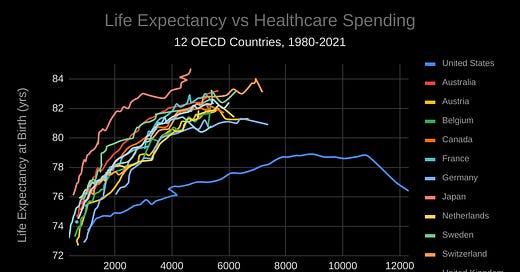
In 2021, US life expectancy hit its lowest level in 25 years. That’s according to data released last December by the CDC. The Peterson Center on Healthcare and the Kaiser Family Foundation posted an article the same month on their Health System Tracker with some stunning data on life expectancy in the US compared to other OECD countries that included a rather depressing graph (for Americans) depicting the trends in life expectancy and healthcare spending for a number of OECD countries over the last four decades:
The US was alone among these countries in seeing a decline in life expectancy since 1997. Over the same period, the comparable country average (the average among the eleven other OECD countries) was a gain of four years in life expectancy. The US saw a decrease of 0.1 years.
Meanwhile, healthcare expenditures absolutely soared in the US. This graph, which I put together using the source data from the Peterson-KFF piece, compares growth in healthcare spending per capita across the US and eleven other OECD countries since 1980 (the comparable country average is listed as “Comp Avg”):1
And here’s the data since 1997:
Whether you take the longer view or just look at the figures since 1997, the US is in a league of its own. In each case, it roughly doubled the comparable country average in spending growth.
The Peterson-KFF piece combines the data on healthcare expenditures with the data on life expectancy to produce the graph included above. The original article provides a visual only for the entire period from 1980 through 2021, which makes it a bit difficult to see the US breaking away from the pack over time in much detail. For that reason, I decided to graph the data decade-by-decade so we can see the country trends with more precision.2
I also reproduced the graph from Peterson-KFF for the full period for two reasons:
(1) It used the provisional number for US life expectancy released by the CDC in August, so updating the data improves accuracy (specifically, I swapped in the December 2022 number of 76.4 years for 2021 US life expectancy for the previous provisional number of 76.1 years).
(2) The way the Peterson-KFF article graphed the data looks sort of strange. I think my version shows more clearly just how extreme the US trajectory has been.
Graph 1.1
Graph 1.2
Graph 1.3
Graph 1.4
Graph 1.5
From the above data, it’s obvious that the US is not getting its money’s worth when it comes to health outcomes. This matches previous findings. For instance, a 2021 study from the Commonwealth Fund found that, among eleven high-income countries, the US ranked last in terms of health outcomes (made up of ten component measures, nine of which had the US in last place) despite spending the most on healthcare as a percentage of GDP.
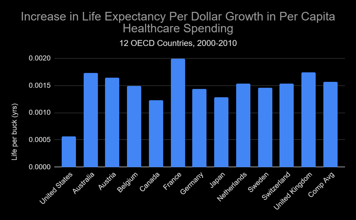
To get a better sense of how far a dollar of healthcare spending goes in the US versus other countries, I looked at how much each additional dollar in spending added to overall life expectancy in the US versus other OECD countries over the last several decades.3 We can call this measure “life per buck.” I graphed it below for all countries over the entire period from 1980 through 2021 and then for each decade within that time span.
“Life per buck” = (Increase in average life expectancy) / (Increase in per capita healthcare spending)4
Graph 2.1
Graph 2.2
Graph 2.3
Graph 2.4
Graph 2.5
The US ranks lowest in terms of “life per buck” in each and every one of these time frames. Most appalling is the latest time frame. From 2010 through 2021, every dollar in additional spending on healthcare in the US actually bought a decrease in life expectancy. Sounds more like a deal with the devil than a program for the future.
America likes to think of itself as a model for the rest of the world, a beacon of democracy and hope. This data on life expectancy and healthcare spending suggest it may be time to look in the mirror.
Subscribe!
If you enjoyed this post, please subscribe! You will be notified when my posts go up and will have the newsletter delivered directly to your inbox.
And share!
And please share! I’m building this newsletter from the ground up, so everything helps.
Share this post:
Share Objective Propaganda:
Life expectancy measured in years. Spending measured in PPP-adjusted dollars.


